Look over some of my design samples:
Picture Quotes--Mormon Insights
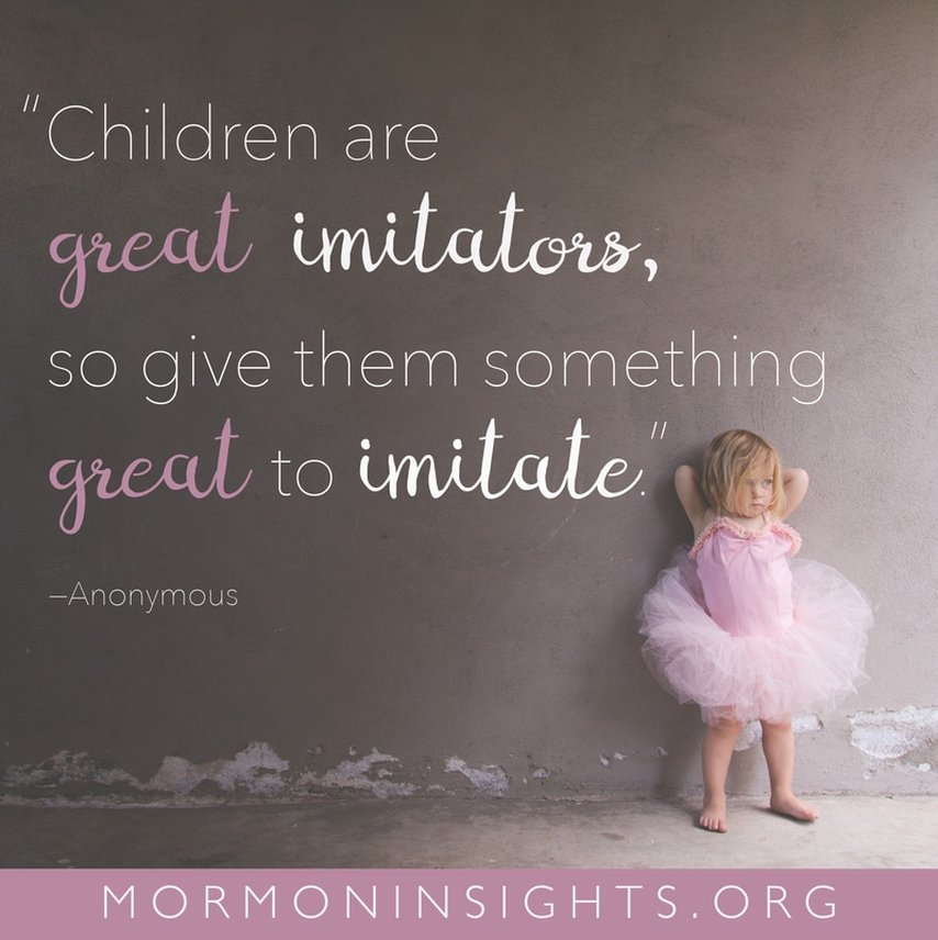
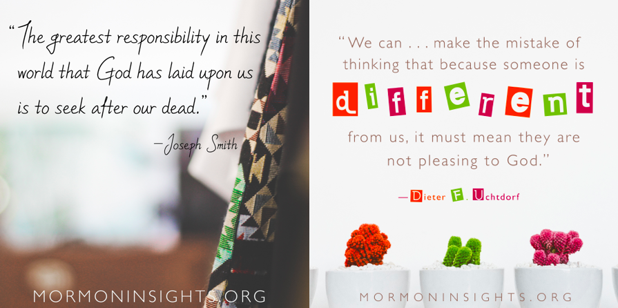
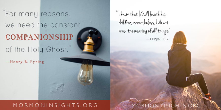
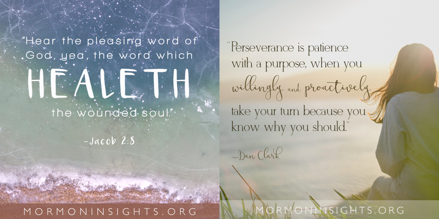
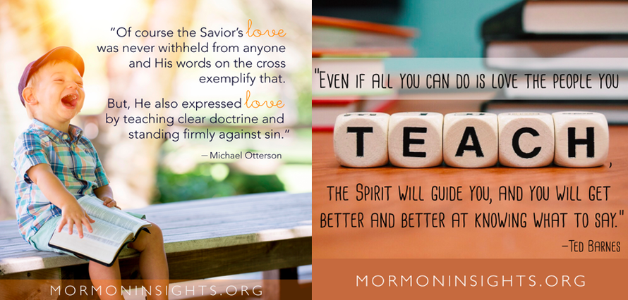
As a member of the Mormon Insights design team, I created multiple picture quotes (PQs). These PQs were both published on the website alongside the articles and posted on multiple social media platforms. The process of creating a PQ includes choosing a quote from the article, finding a Public Domain photo, resizing the photo to a certain size, finding fonts that align with and complement the pictures, and adding the mormon insights.org address to the bottom of the photo.
As a member of the Mormon Insights design team, I created multiple picture quotes (PQs). These PQs were both published on the website alongside the articles and posted on multiple social media platforms. The process of creating a PQ includes choosing a quote from the article, finding a Public Domain photo, resizing the photo to a certain size, finding fonts that align with and complement the pictures, and adding the mormon insights.org address to the bottom of the photo.
Poster and Logo—Writing Fellows
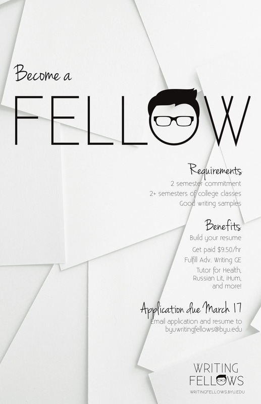
The following is a logo and poster that I created for my workplace. I was asked by my boss to create a more aesthetically pleasing poster for recruiting new Writing Fellows. Since Writing Fellows did not have a working logo, I created several options for the logo, and used the chosen logo in the poster. The audience for this design is student who are interested in editing and writing and are looking for a fun work atmosphere. When creating the poster, I used a lot of white space, so the poster could look clean and crisp. I also used a left-side alignment to make the poster look more unified and clear. (The new logo is at the right bottom corner of the poster.)
The following is a logo and poster that I created for my workplace. I was asked by my boss to create a more aesthetically pleasing poster for recruiting new Writing Fellows. Since Writing Fellows did not have a working logo, I created several options for the logo, and used the chosen logo in the poster. The audience for this design is student who are interested in editing and writing and are looking for a fun work atmosphere. When creating the poster, I used a lot of white space, so the poster could look clean and crisp. I also used a left-side alignment to make the poster look more unified and clear. (The new logo is at the right bottom corner of the poster.)
Book—Promptly Keenan
This sample is a book that I designed for Promptly Keenan. Promptly Keenan is a blog that my family-in-law created. Each week, they all write a short story based on a single prompt and post it on the website. The concept I came up with for this design was to have symbols representing the four different genres (horror, comedy, romance, and mystery) drawn quickly and crammed together, in order to convey that the book was a collection of quickly-written short stories that cover many different genres. The audience for this book was first, my family-in-law, and second, people who love reading short stories. The first picture below is of the book's front and back cover. Underneath that is a photo of the inside of the book.
This sample is a book that I designed for Promptly Keenan. Promptly Keenan is a blog that my family-in-law created. Each week, they all write a short story based on a single prompt and post it on the website. The concept I came up with for this design was to have symbols representing the four different genres (horror, comedy, romance, and mystery) drawn quickly and crammed together, in order to convey that the book was a collection of quickly-written short stories that cover many different genres. The audience for this book was first, my family-in-law, and second, people who love reading short stories. The first picture below is of the book's front and back cover. Underneath that is a photo of the inside of the book.
Flyer—"Serving Up Smiles" Event
When working for an orthodontics office, I created this flyer for their "Serving Up Smiles" event, in which the office gave free ice cream to their patients. The audience of the event was children ages 8-16 who are currently wearing braces. I wanted to make a flyer that connected the concepts of ice-cream party and orthodontics office in a unique way. Therefore, I made a line with brackets that went through the ice cream cones, as if the cones were teeth with braces. I aligned the text on the right side of the page in order to make the design look more crisp and organized. I also made the hierarchy in the flyer clear by using a bold font for "Serving Free Ice Cream" over the other basic information about the event.
When working for an orthodontics office, I created this flyer for their "Serving Up Smiles" event, in which the office gave free ice cream to their patients. The audience of the event was children ages 8-16 who are currently wearing braces. I wanted to make a flyer that connected the concepts of ice-cream party and orthodontics office in a unique way. Therefore, I made a line with brackets that went through the ice cream cones, as if the cones were teeth with braces. I aligned the text on the right side of the page in order to make the design look more crisp and organized. I also made the hierarchy in the flyer clear by using a bold font for "Serving Free Ice Cream" over the other basic information about the event.
